
I haven’t used this site in a while, mostly because I got out of the habit, and also because I got a little sick of thinking about the kinds of things that I tend to write about here. It’s also probably because a lot of what I did here served as an outlet to dive deeper into conversations I was having on Facebook, and those conversations haven’t been as interesting lately, probably because people who disagreed with me seem less likely to jump in in the post-Trump era. But today I found myself thinking about COVID and omicron and I did a bit of graph comparing that fits pretty well here, so I’m back at it.
This exercise started because of lots of news that omicron is less dangerous. By less dangerous, folks mean less deadly. I have tried to be optimistic throughout the pandemic, and that’s burned me repeatedly. Early on, I figured the kids would be home from school for a few days, and we’d get back to normal quickly. I was in a leadership role of a scientific society and thought for sure that our summer 2020 meeting would happen as planned, and even agreed to stay on for an unprecedented two-year term because I was completely sure that the 2021 meeting would happen in person and be great. I was wrong about all of that.
Given my pretty bad track record, I’ve tried to be a little less optimistic, and have been very critical whenever I have these glimpses of thinking there’s good news. So when I kept hearing that omicron is less deadly, it made me wonder if it was just not yet less deadly. Death has always been a bit of a trailing metric. A rise in cases without a rise in deaths has most often been followed by a rise in deaths, so I worried that we were just not there yet. But when I read, and then saw graphs showing, that the surge in South Africa seemed to be on it’s way toward an end, it made me think that the looming possibility of lagging deaths might not happen. So I started capturing graphs and overlying them. New cases and deaths. All auto scaled, so the height of the lines don’t match, and aren’t supposed to, but the proportionate relationship between cases and deaths is clear.
I started with South Africa, because that’s where my head was when this exercise started. The relationship between cases and deaths was pretty proportionate for the first three waves, but that fourth wave, presumably caused by omicron, looks a lot different, at least so far.

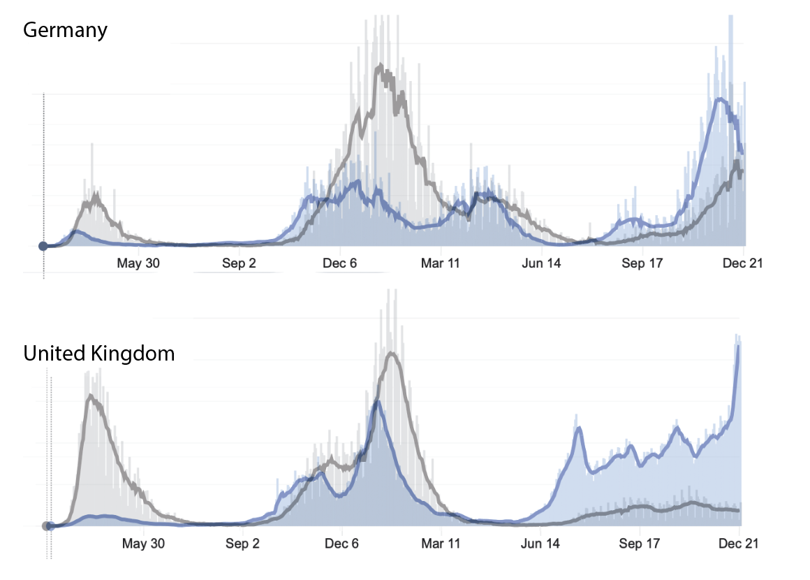
This got me thinking about other places. What about parts of Europe? So I somewhat arbitrarily looked at Germany and the UK and found some notable differences. Both were unlike South Africa in the disproportionate death numbers. Some of this is undoubtely because of autoscaling. Case numbers in Germany hit their highest level in the fall of 2021, with relatively fewer deaths, making the relatively high death rates last winter and at the very start of the pandemic, appear disproportionately high. In the UK, the disproportionate number of deaths early on (in the first wave) is the complete opposite of the third wave, in which deaths appear relatively low.
And then there’s the United States, which really can’t be treated as a homogeneous population. Even thinking about states as one thing is probably a mistake on many levels, but I didn’t dive deeper than states for this one. So I started with New York, my home state. New York got hit hard early on, but it’s comforting to see that the first wave was the only wave in which deaths were disproportionately high, relative to cases. In the second wave (winter 2020/2021), the overlay looks a lot different. New York has had a very large surge in new cases in the past week, which could be seen as a fourth wave, if the moderate increase in cases starting in the late summer/early fall is a third wave, that blends into the fourth wave. Whether we call it a third wave or a fourth wave, so far, it hasn’t led to a correlated increase in deaths. My hope is that our current wave will look like South Africa’s fourth wave, and deaths will stay flat even as new cases (of mostly omicron) surge. Fingers crossed.

I also decided to look at Florida, mostly because I have family there, am traveling there soon, and because it’s been compared with New York repeatedly by the media and others who are either trying to make political points, or actually trying to understand the difference that public policy can make on the spread and impact of the pandemic. I think the latter is important, but also remind myself that it’s not an apples to apples comparison. The weather/climate seems to play a big role. Florida’s first wave hit as their summer got hot. There was a second wave last winter, that followed many parts of the country, but Florida had a third wave that came earlier than New York’s, perhaps because of the ratio of indoor and outdoor activities. But what’s the most interesting to me here is the consistent relative proportion of deaths to cases in Florida. The lines are almost identical, with a rightward shift in deaths that’s a couple of weeks. Florida looks to have the start of a fourth wave, so it will be very interesting to know if that wave continues, and if it does, if it comes with the same proportion of deaths that the summer/fall wave brought (which is very different from New York’s thirst wave). Time will tell here.

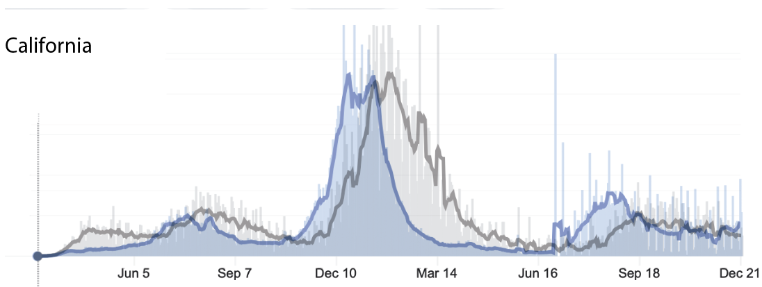
California has also been a bit different from other places. It’s an interesting state because the weather is so different in the northern and southern parts of the state, and because it’s got densely populated areas that are especially challenging with respect to COVID. I also liked including California because I didn’t want to make this a Red State Blue State thing. California largely avoided a first wave, which is completely inconsistent with an earlier notion that COVID spread to the United States from Asia. That very likely would have related to the high level of travel to and from California. The surge in New York that came before the rest of the country seems far more consistent with the idea that the virus made a stop in Europe before coming to the United States. But that’s not the point here. The point here is that California looks a lot more like Florida in terms of the proportion of cases and deaths. The shape and relative height of the lines are remarkably similar. It doesn’t appear that California is experiencing a new wave, but if it comes, it will be very promising if it comes with new cases, but not new deaths.
Of course, my optimism here is tempered by the realization that death isn’t the only negative outcome from COVID. But my hope is that severity of infection and death are tightly correlated, so fewer deaths also means fewer severe cases, and hopefully less long-COVID. But, at this point, I’ve spent too much time on this and need to get back to my actual job, so I apologize for any typos, bad grammar, sentence fragments, and sloppy writing. Maybe sometime in the future I’ll read what I wrote and make some edits, but that’s not usually my style, so…
